
This chapter describes all the different HTML form elements.
HTML Form Elements
| Tag | Description |
|---|---|
<form> |
Defines an HTML form for user input |
<input> |
Defines an input control |
<textarea> |
Defines a multiline input control (text area) |
<label> |
Defines a label for an <input> element |
<fieldset> |
Groups related elements in a form |
<legend> |
Defines a caption for a <fieldset> element |
<select> |
Defines a drop-down list |
<optgroup> |
Defines a group of related options in a drop-down list |
<option> |
Defines an option in a drop-down list |
<button> |
Defines a clickable button |
<datalist> |
Specifies a list of pre-defined options for input controls |
<output> |
Defines the result of a calculation |
The HTML <form> Elements
The HTML <form> element can contain one or more of the following form elements:
<input><label><select><textarea><button><fieldset><legend><datalist><output><option><optgroup>
The <input> Element
One of the most used form element is the <input> element.
The <input> element can be displayed in several ways, depending on the type attribute.
Example:
<label for="fname">First name:</label>
<input type="text"  id="fname"  name="fname">
All the different values of the type attribute are covered in the next chapter: HTML Input Types.
The <label> Element
The <label> element defines a label for several form elements.
The <label> element is useful for screen-reader users, because the screen-reader will read out loud the label when the user focus on the input element.
The <label> element also help users who have difficulty clicking on very small regions (such as radio buttons or checkboxes) - because when the user clicks the text within the <label> element, it toggles the radio button/checkbox.
The for attribute of the <label> tag should be equal to the id attribute of the <input> element to bind them together.
The <select> Element
The <select> element defines a drop-down list:
Example:
<label for="cars">Choose a car:</label>
<select id="cars"  name="cars">
	<option value="volvo">Volvo</option>
	<option value="saab">Saab</option>
	<option value="fiat">Fiat</option>
	<option value="audi">Audi</option>
</select>
The <option> elements defines an option that can be selected.
By default, the first item in the drop-down list is selected.
To define a pre-selected option, add the selected attribute to the option:
<option value="fiat" selected>Fiat</option>Visible Values:
Use the size attribute to specify the number of visible values:
<label for="cars">Choose a car:</label>
<select id="cars"  name="cars"  size="3">
	<option value="volvo">Volvo</option>
	<option value="saab">Saab</option>
	<option value="fiat">Fiat</option>
	<option value="audi">Audi</option>
</select>
Allow Multiple Selections:
Use the multiple attribute to allow the user to select more than one value:
Example:
<label for="cars">Choose a car:</label>
<select id="cars"  name="cars"  size="4"  multiple>
	<option value="volvo">Volvo</option>
	<option value="saab">Saab</option>
	<option value="fiat">Fiat</option>
	<option value="audi">Audi</option>
</select>
The <textarea> Element
The <textarea> element defines a multi-line input field (a text area):
Example:
<textarea name="message" rows="10" cols="30">
The cat was playing in the garden.
</textarea>
Note:
- The
rowsattribute specifies the visible number of lines in a text area. - The
colsattribute specifies the visible width of a text area.
You can also define the size of the text area by using CSS:
<textarea name="message"  style="width:200px; height:600px;">
The cat was playing in the garden.
</textarea>
The <button> Element
The <button> element defines a clickable button:
<button type="button" onclick="alert('Hello World!')">Click Me!</button>The <fieldset> and <legend> Elements
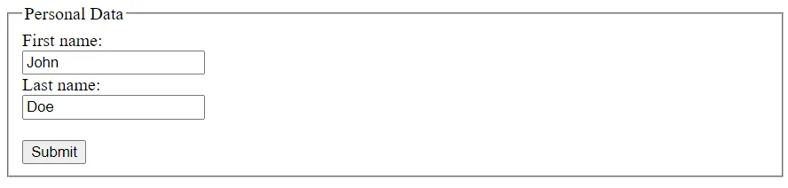
The <fieldset> element is used to group related data in a form.
The <legend> element defines a caption for the <fieldset> element.
<form action="/action_page.php">
	<fieldset>
		<legend>Personal Data:</legend>
		<label for="fname">First name:</label><br>
		<input type="text"  id="fname"  name="fname"  value="John"><br>
		<label for="lname">Last name:</label><br>
		<input type="text"  id="lname"  name="lname"  value="Doe"><br><br>
		<input type="submit"  value="Submit">
	</fieldset>
</form>
Output:
The <datalist> Element
The <datalist> element specifies a list of pre-defined options for an <input> element.
Users will see a drop-down list of the pre-defined options as they input data.
The list attribute of the <input> element, must refer to the id attribute of the <datalist> element.
<form action="/action_page.php">
	<input list="browsers">
	<datalist id="browsers">
		<option value="Internet Explorer">
		<option value="Firefox">
		<option value="Chrome">
		<option value="Opera">
		<option value="Safari">
	</datalist>
</form>
The <output> Element
The <output> element represents the result of a calculation (like one performed by a script).
Example: perform a calculation and show the result in an <output> element.
<form action="/action_page.php"
oninput="x.value=parseInt(a.value)+parseInt(b.value)">
0
	<input type="range" id="a"  name="a"  value="50">
	100 +
	<input type="number"  id="b"  name="b"  value="50">
	=
	<output name="x"  for="a b"></output>
	<br>
	<br>
	<input type="submit">
</form>