
Create a hoverable dropdown with CSS.
Basic Dropdown
Create a dropdown box that appears when the user moves the mouse over an element.
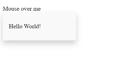
<style>
	.dropdown  {
		position:  relative;
		display:  inline-block;
	}

	.dropdown-content  {
		display:  none;
		position:  absolute;
		background-color:  #f9f9f9;
		min-width:  160px;
		box-shadow:  0px 8px 16px 0px rgba(0,0,0,0.2);
		padding:  12px 16px;
		z-index:  1;
	}

	.dropdown:hover .dropdown-content  {
		display:  block;
	}
</style>

<div class="dropdown">
	<span>Mouse over me</span>
	<div class="dropdown-content">
		<p>Hello World!</p>
	</div>
</div>
Explanation:
-
HTML: Use any element to open the dropdown content, e.g. a
<span>, or a<button>element. Use a container element (like<div>) to create the dropdown content and add whatever you want inside of it. Wrap a<div>element around the elements to position the dropdown content correctly with CSS. -
CSS: The
.dropdownclass usesposition:relative, which is needed when we want the dropdown content to be placed right below the dropdown button (usingposition:absolute). The.dropdown-contentclass holds the actual dropdown content. It is hidden by default, and will be displayed on hover (see below). Note themin-widthis set to 160px. Feel free to change this.
Instead of using a border, we have used the CSSbox-shadowproperty to make the dropdown menu look like a "card". The:hoverselector is used to show the dropdown menu when the user moves the mouse over the dropdown button.
Dropdown Menu
Create a dropdown menu that allows the user to choose an option from a list.
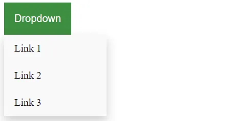
This example is similar to the previous one, except that we add links inside the dropdown box and style them to fit a styled dropdown button.
<style>
	/* Style The Dropdown Button */
	.dropbtn  {
		background-color:  #4CAF50;
		color:  white;
		padding:  16px;
		font-size:  16px;
		border:  none;
		cursor:  pointer;
	}

	/* The container <div> - needed to position the dropdown content */
	.dropdown  {
		position:  relative;
		display:  inline-block;
	}

	/* Dropdown Content (Hidden by Default) */
	.dropdown-content  {
		display:  none;
		position:  absolute;
		background-color:  #f9f9f9;
		min-width:  160px;
		box-shadow:  0px 8px 16px 0px rgba(0,0,0,0.2);
		z-index:  1;
	}

	/* Links inside the dropdown */
	.dropdown-content a  {
		color:  black;
		padding:  12px 16px;
		text-decoration:  none;
		display:  block;
	}

	/* Change color of dropdown links on hover */
	.dropdown-content a:hover  {background-color:  #f1f1f1}

	/* Show the dropdown menu on hover */
	.dropdown:hover .dropdown-content  {
		display:  block;
	}

	/* Change the background color of the dropdown button when the dropdown content is shown */
	.dropdown:hover .dropbtn  {
		background-color:  #3e8e41;
	}
</style>

<div class="dropdown">
	<button class="dropbtn">Dropdown</button>
	<div class="dropdown-content">
		<a href="#">Link 1</a>
		<a href="#">Link 2</a>
		<a href="#">Link 3</a>
	</div>
</div>
Right-aligned Dropdown Content
If you want the dropdown menu to go from right to left, instead of left to right, add right: 0;
.dropdown-content {
	right:  0;
}