
What is Responsive Web Design?
Responsive web design makes your web page look good on all devices.
Responsive web design uses only HTML and CSS.
Responsive web design is not a program or a JavaScript.
Designing For The Best Experience For All Users
Web pages can be viewed using many different devices: desktops, tablets, and phones. Your web page should look good, and be easy to use, regardless of the device.
Web pages should not leave out information to fit smaller devices, but rather adapt its content to fit any device:
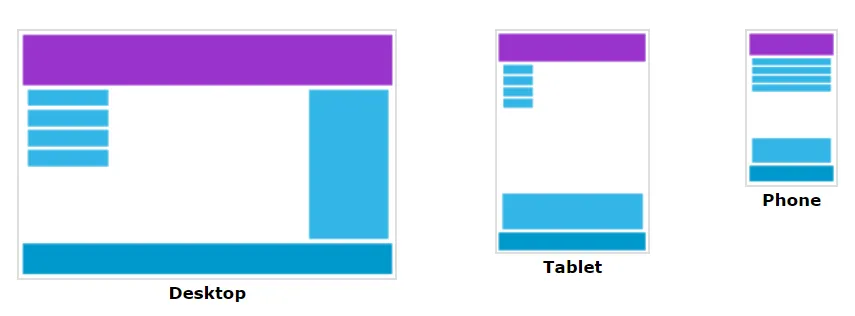
It is called responsive web design when you use CSS and HTML to resize, hide, shrink, enlarge, or move the content to make it look good on any screen.