Let us look at some more examples of using media queries.
Media queries are a popular technique for delivering a tailored style sheet to different devices.
Media Queries For Menus
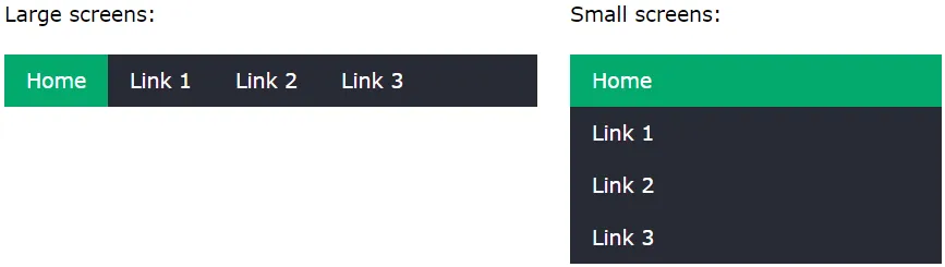
In this example, we use media queries to create a responsive navigation menu, that varies in design on different screen sizes.
/* The navbar container */
.topnav {
	overflow:  hidden;
	background-color:  #333;
}

/* Navbar links */
.topnav a {
	float:  left;
	display:  block;
	color:  white;
	text-align:  center;
	padding:  14px 16px;
	text-decoration:  none;
}

/* On screens that are 600px wide or less, make the menu links stack on top of each other instead of next to each other */
@media screen and (max-width: 600px) {
	.topnav a  {
		float:  none;
		width:  100%;
	}
}
Media Queries For Columns
A common use of media queries, is to create a flexible layout. In this example, we create a layout that varies between four, two and full-width columns, depending on different screen sizes.
Responsive Four Column Layout
/* Create four equal columns that floats next to each other */
.column {
	float:  left;
	width:  25%;
}

/* On screens that are 992px wide or less, go from four columns to two columns */
@media screen and (max-width: 992px) {
	.column  {
		width:  50%;
	}
}

/* On screens that are 600px wide or less, make the columns stack on top of each other instead of next to each other */
@media screen and (max-width: 600px) {
	.column  {
		width:  100%;
	}
}Responsive Four Column Layout with Flex
/* Container for flexboxes */
.row {
	display:  flex;
	flex-wrap:  wrap;
}

/* Create four equal columns */
.column {
	flex:  25%;
	padding:  20px;
}

/* On screens that are 992px wide or less, go from four columns to two columns */
@media screen and (max-width: 992px) {
	.column  {
		flex:  50%;
	}
}

/* On screens that are 600px wide or less, make the columns stack on top of each other instead of next to each other */
@media screen and (max-width: 600px) {
	.row  {
		flex-direction:  column;
	}
}
Hide Elements With Media Queries
Another common use of media queries, is to hide elements on different screen sizes:
/* If the screen size is 600px wide or less, hide the element */
@media screen and (max-width: 600px) {
	div.example  {
		display:  none;
	}
}
Change Font Size With Media Queries
You can also use media queries to change the font size of an element on different screen sizes:
/* If screen size is more than 600px wide, set the font-size of <div> to 80px */
@media screen and (min-width: 600px) {
	div.example  {
		font-size:  80px;
	}
}

/* If screen size is 600px wide, or less, set the font-size of <div> to 30px */
@media screen and (max-width: 600px) {
	div.example  {
		font-size:  30px;
	}
}
Orientation: Portrait / Landscape
Media queries can also be used to change layout of a page depending on the orientation of the browser.
You can have a set of CSS properties that will only apply when the browser window is wider than its height, a so called "Landscape" orientation.
Example: use a lightblue background color if the orientation is in landscape mode:
@media only screen and (orientation: landscape) {
	body  {
		background-color:  lightblue;
	}
}
Min Width to Max Width
You can also use the (max-width: _.._) and (min-width: _.._) values to set a minimum width and a maximum width.
For example, when the browser's width is between 600 and 900px, change the appearance of a <div> element:
@media screen and (max-width: 900px) and (min-width: 600px) {
	div.example  {
		font-size:  50px;
		padding:  50px;
		border:  8px solid black;
		background:  yellow;
	}
}
Using an additional value: In the example below, we add an additional media query to our already existing one using a comma (this will behave like an OR operator):
/* When the width is between 600px and 900px OR  above 1100px - change the appearance of <div> */
@media screen and (max-width: 900px) and (min-width: 600px), (min-width: 1100px) {
	div.example  {
		font-size:  50px;
		padding:  50px;
		border:  8px solid black;
		background:  yellow;
	}
}