With the CSS border-image property, you can set an image to be used as the border around an element.
CSS border-image Property
The CSS border-image property allows you to specify an image to be used instead of the normal border around an element.
The property has three parts:
- The image to use as the border
- Where to slice the image
- Define whether the middle sections should be repeated or stretched
We will use the following image (called "border.png"):

The border-image property takes the image and slices it into nine sections, like a tic-tac-toe board. It then places the corners at the corners, and the middle sections are repeated or stretched as you specify.
Example:
	border:  10px solid transparent;
	padding:  15px;
	border-image:  url(border.png) 30 round;
}
CSS Border Image Properties
| Property | Description |
|---|---|
| border-image | A shorthand property for setting all the border-image-* properties |
| border-image-source | Specifies the path to the image to be used as a border |
| border-image-slice | Specifies how to slice the border image |
| border-image-width | Specifies the widths of the border image |
| border-image-outset | Specifies the amount by which the border image area extends beyond the border box |
| border-image-repeat | Specifies whether the border image should be repeated, rounded or stretched |
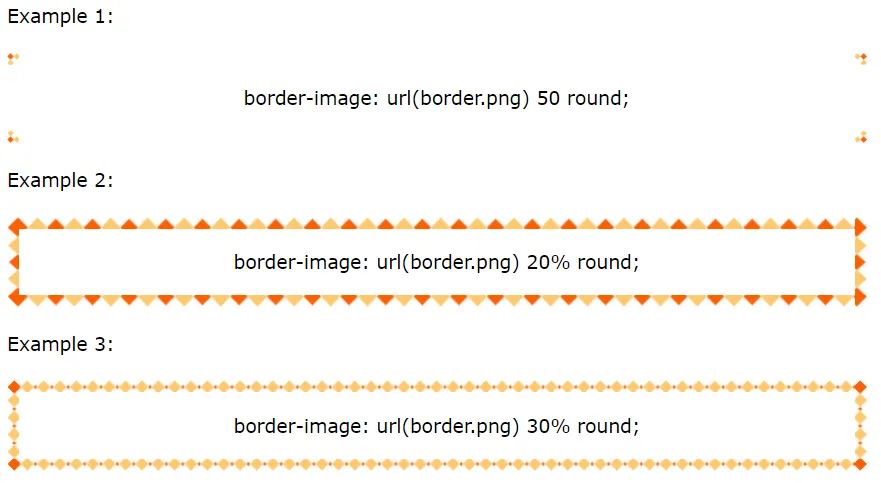
Different Slice Values
Different slice values completely changes the look of the border:
	border:  10px solid transparent;
	padding:  15px;
	border-image:  url(border.png) 50 round;
}

	border:  10px solid transparent;
	padding:  15px;
	border-image:  url(border.png) 20% round;
}

	border:  10px solid transparent;
	padding:  15px;
	border-image:  url(border.png) 30% round;
}